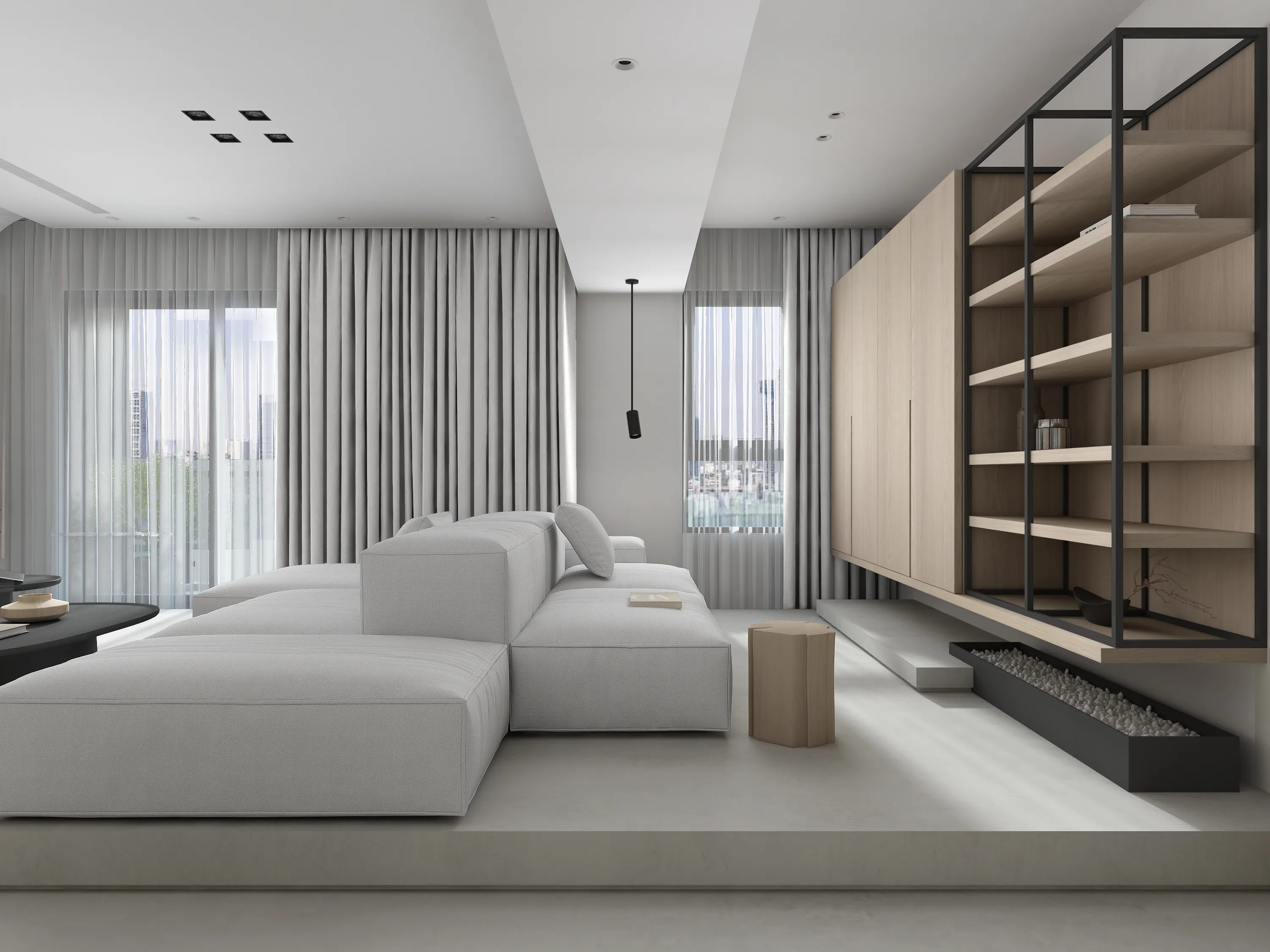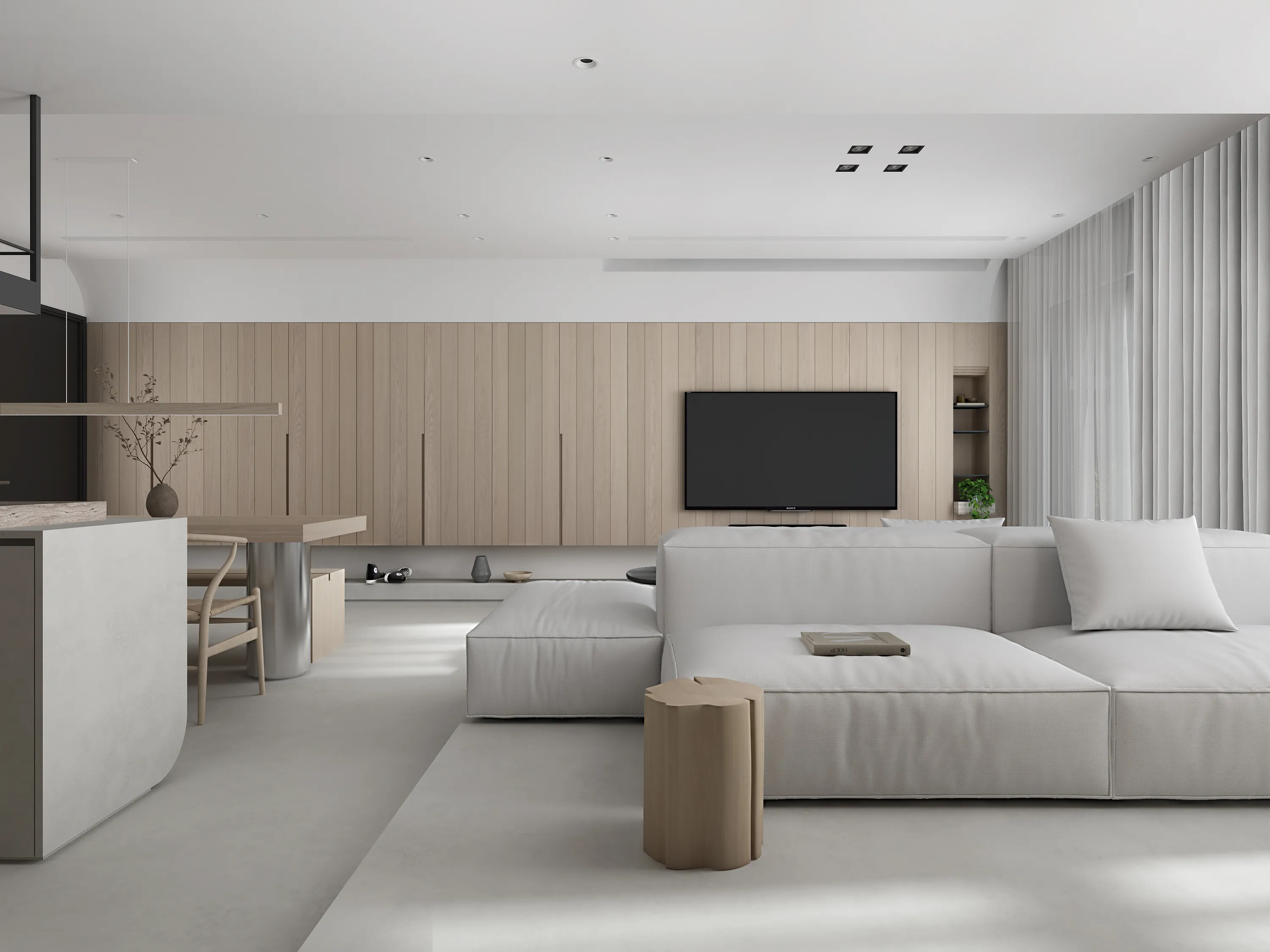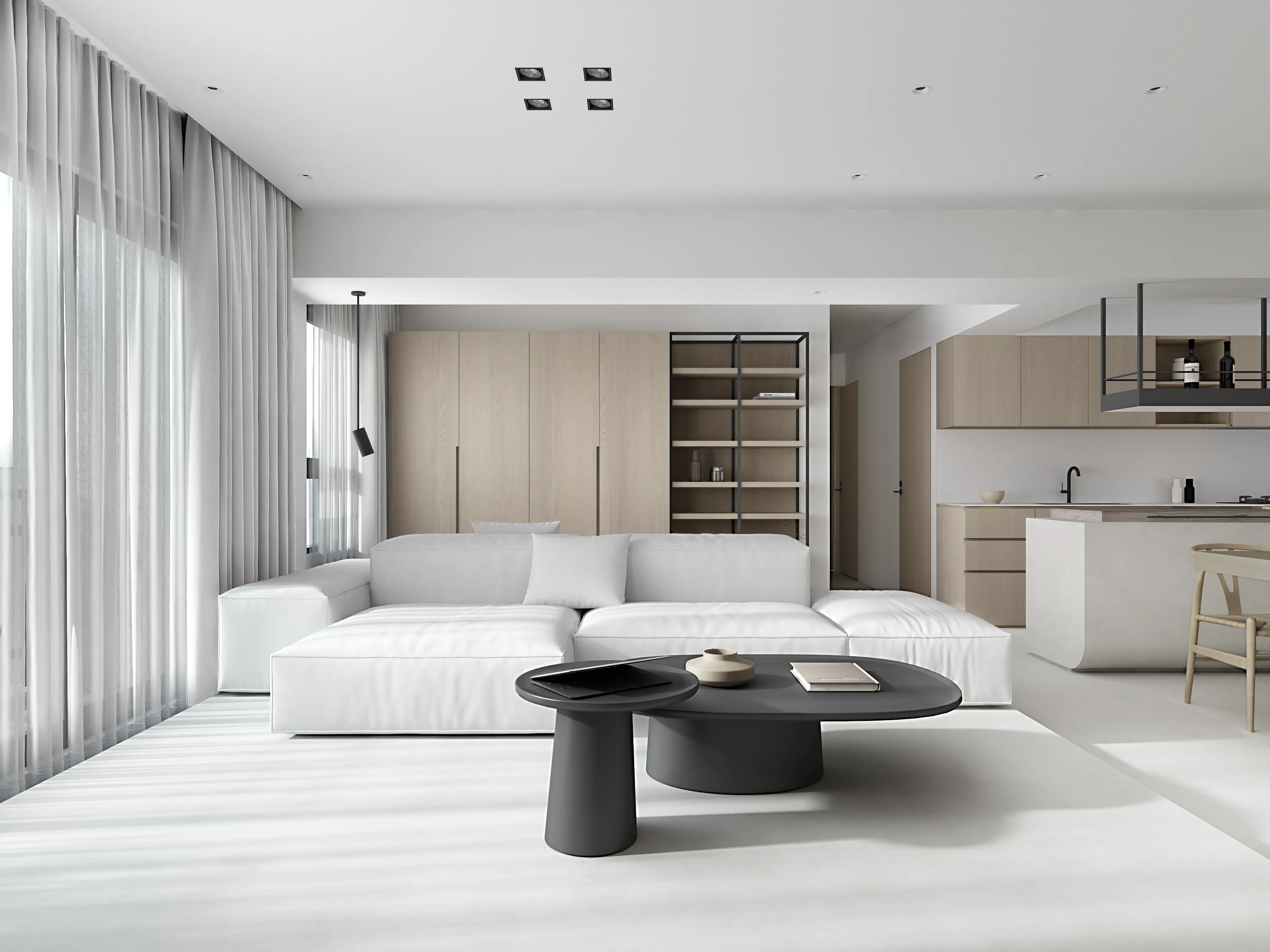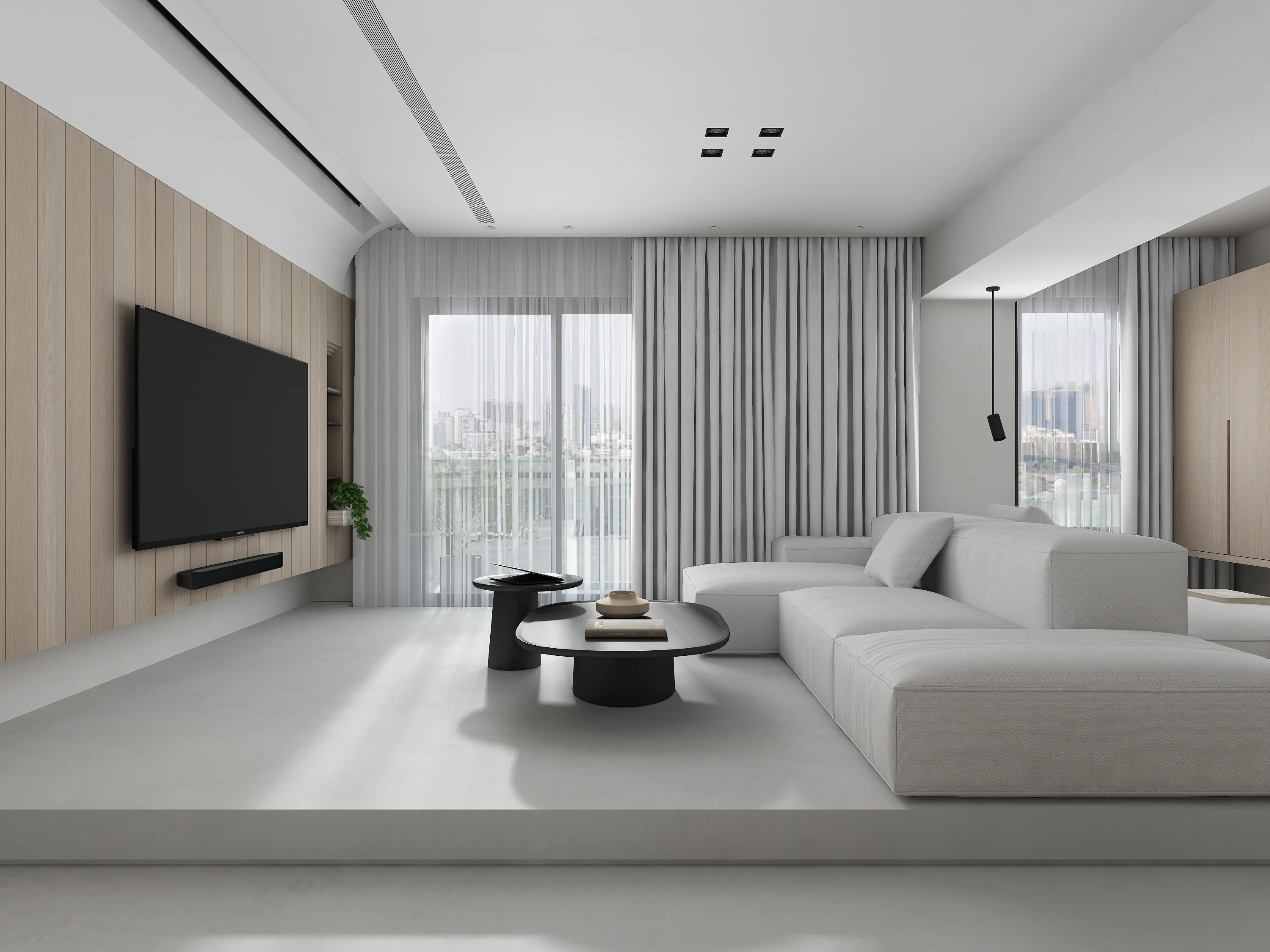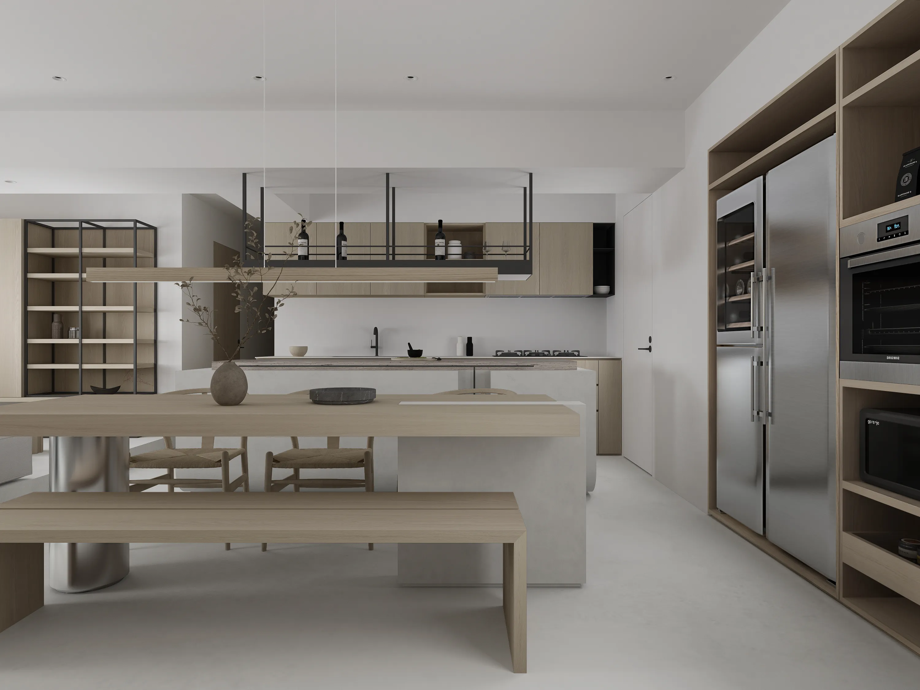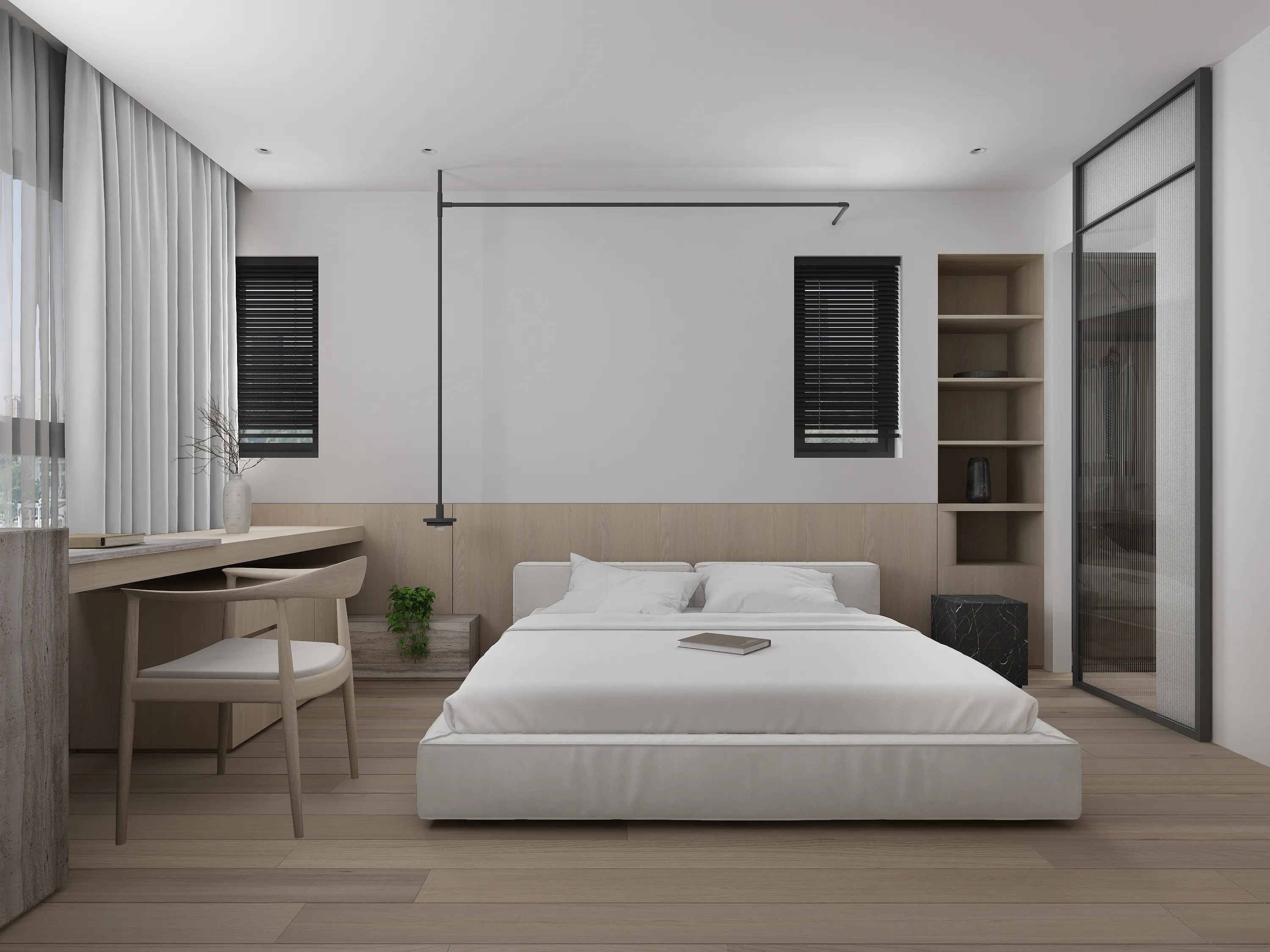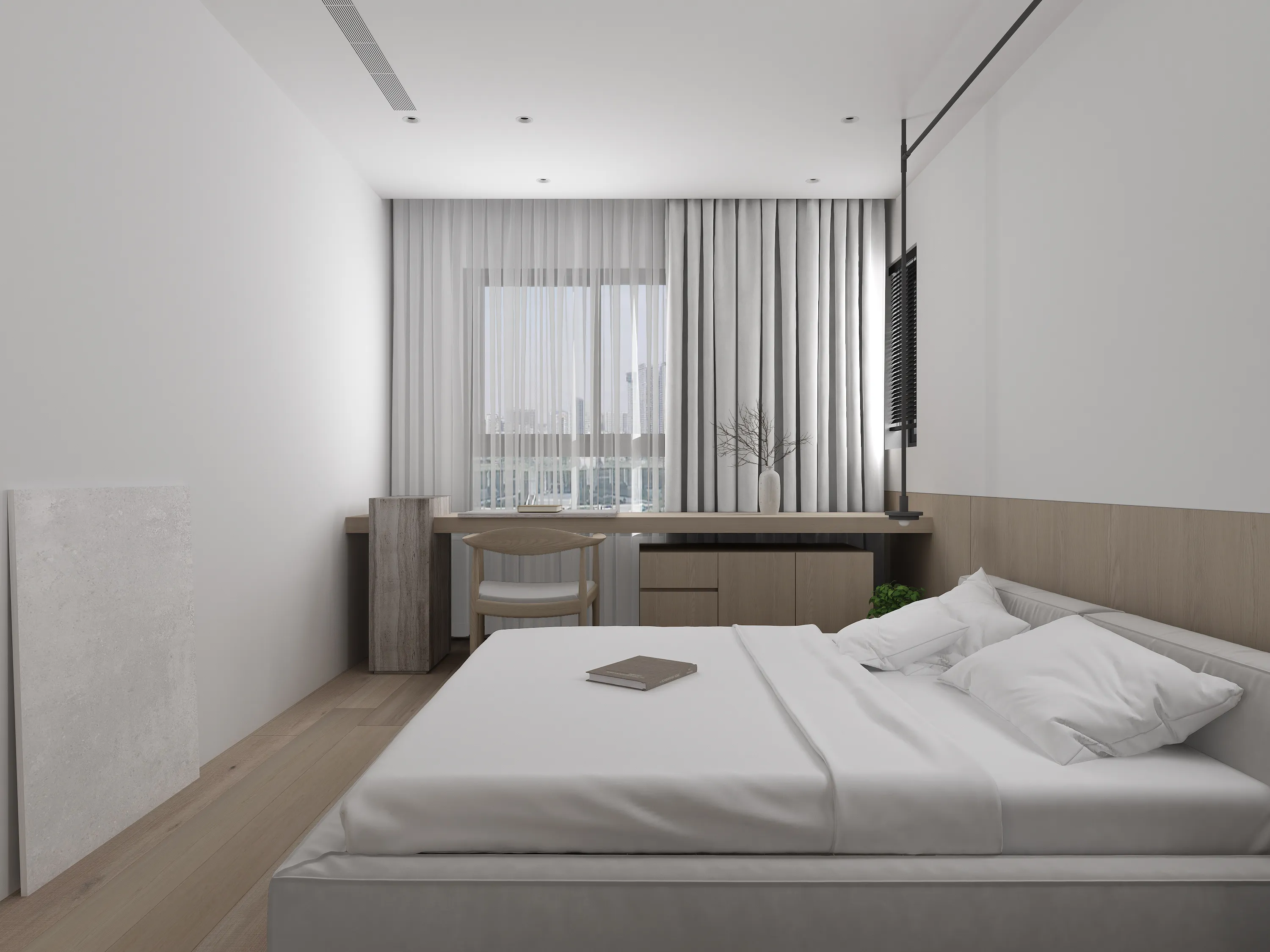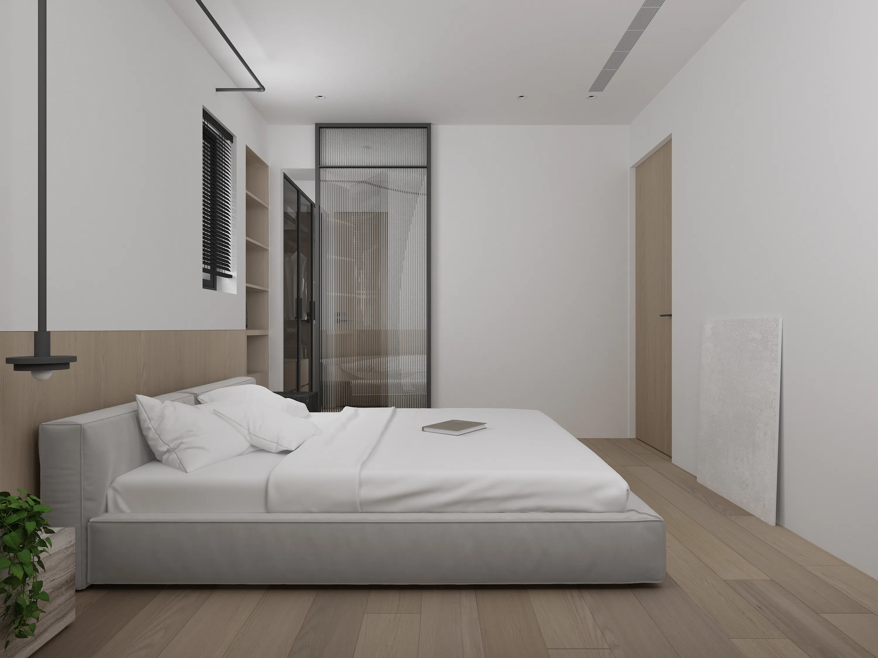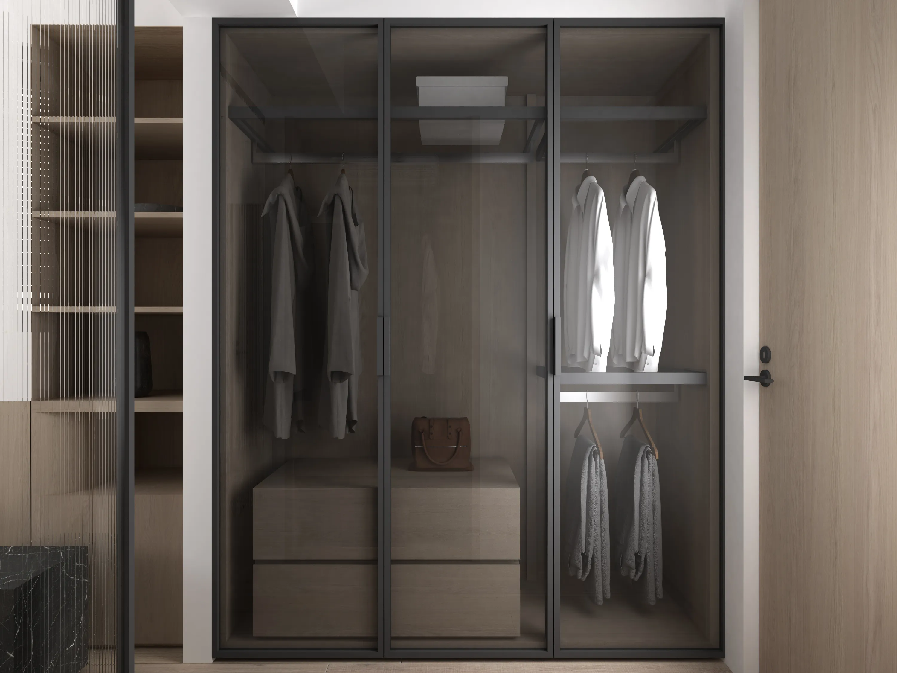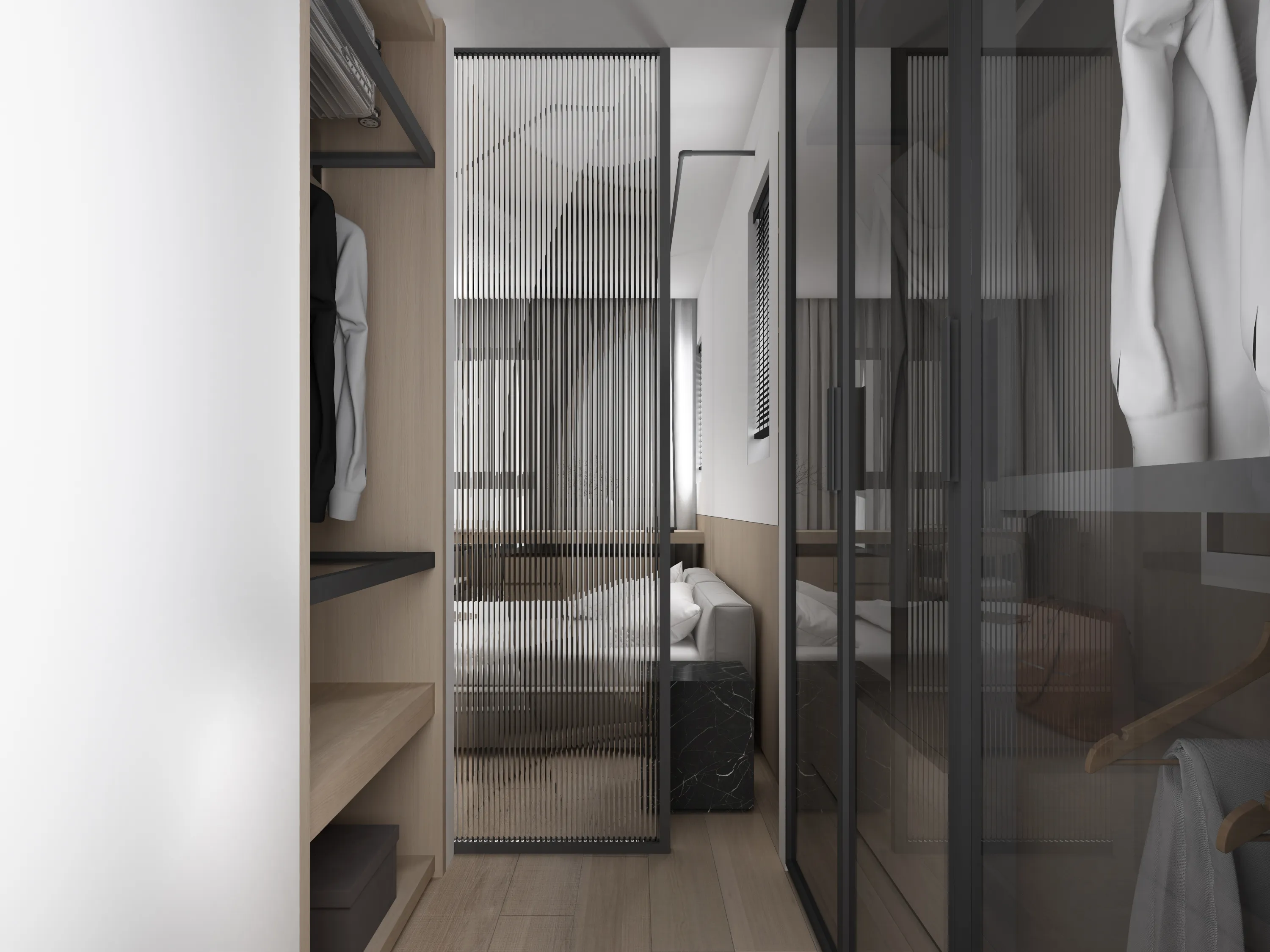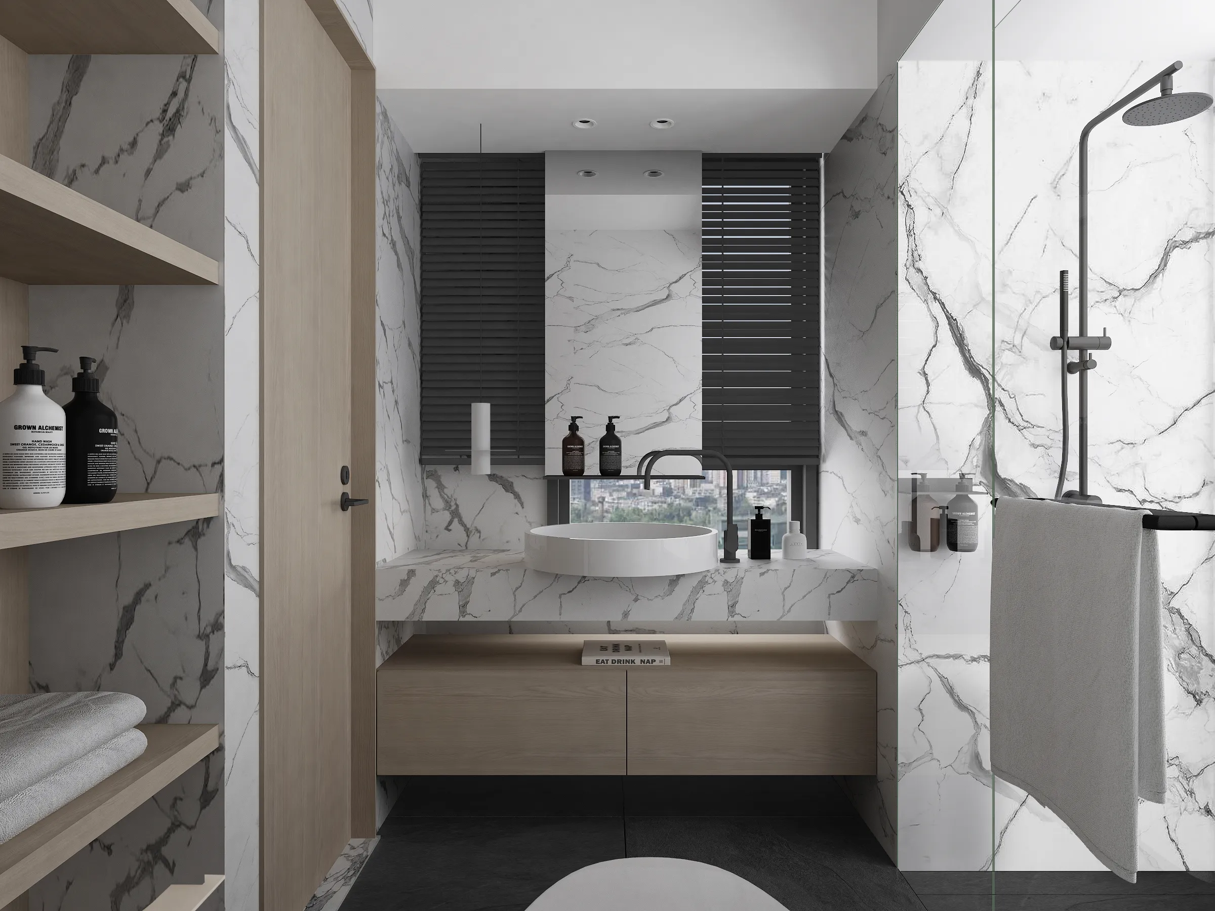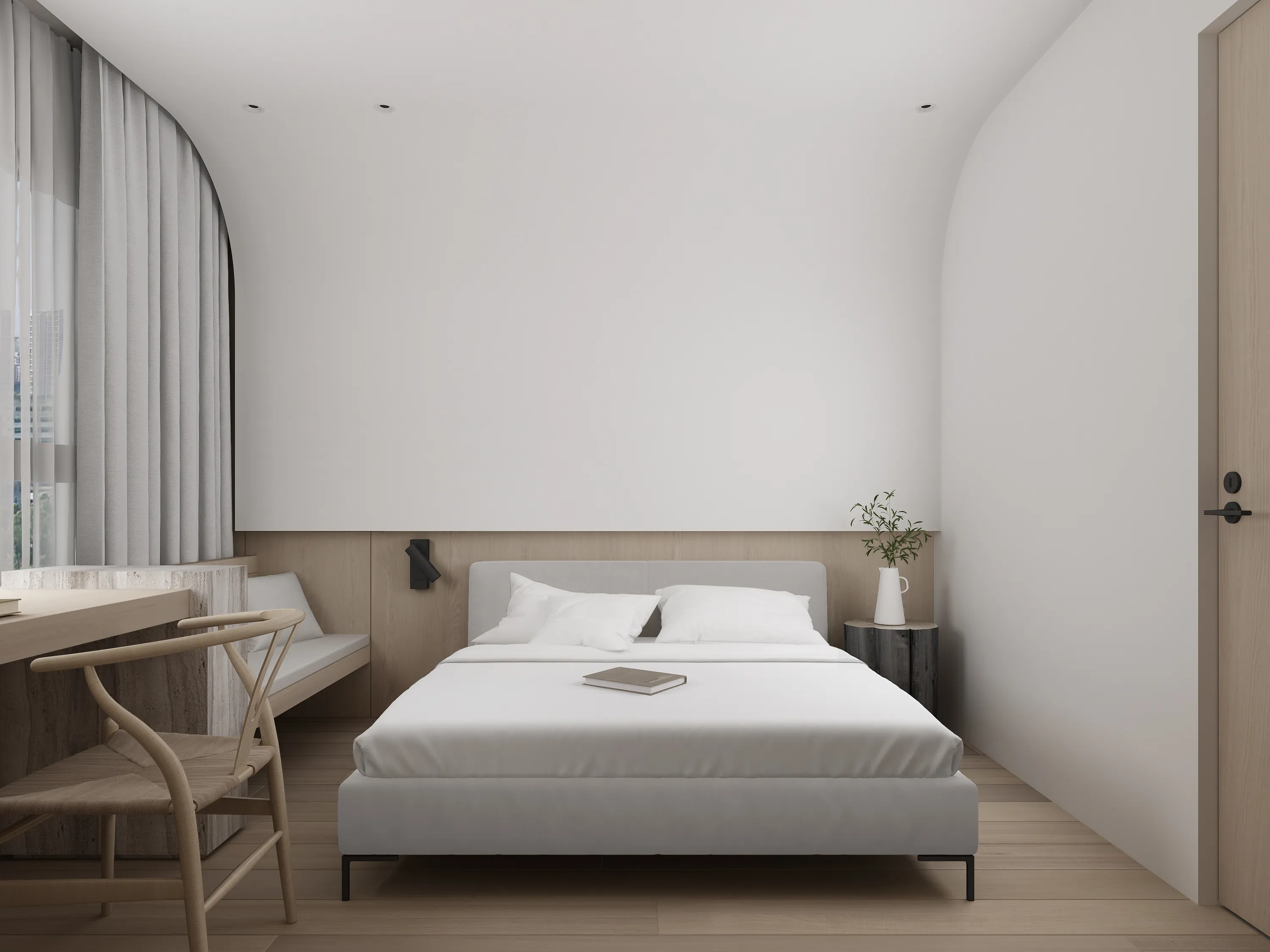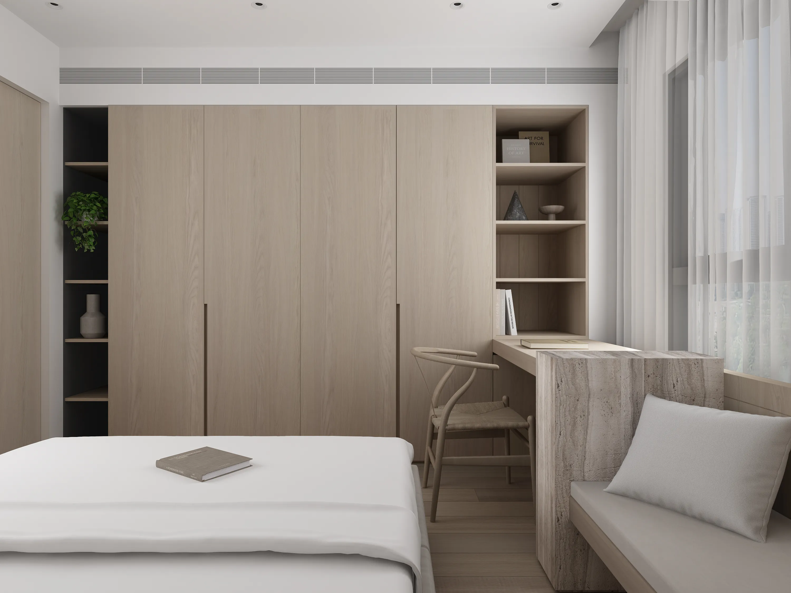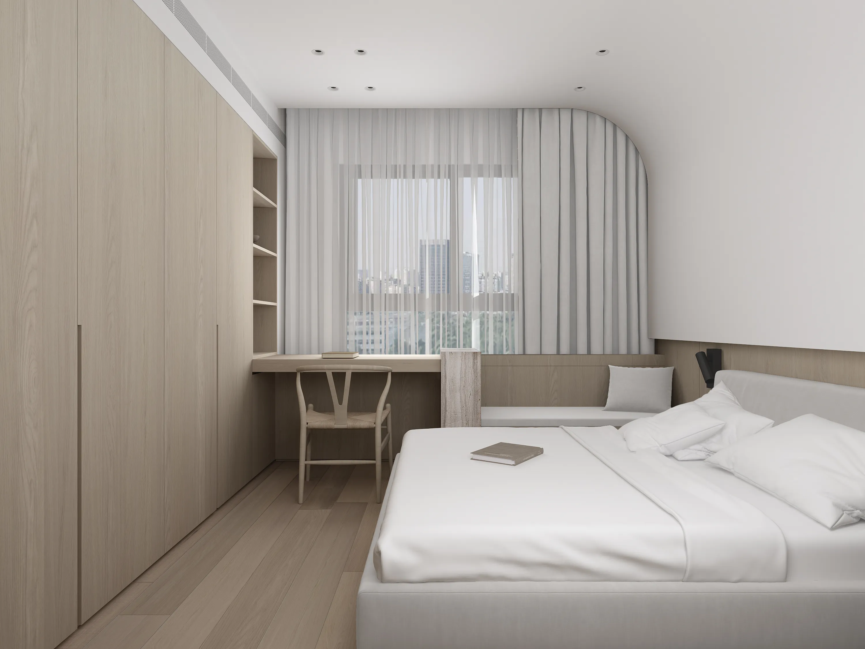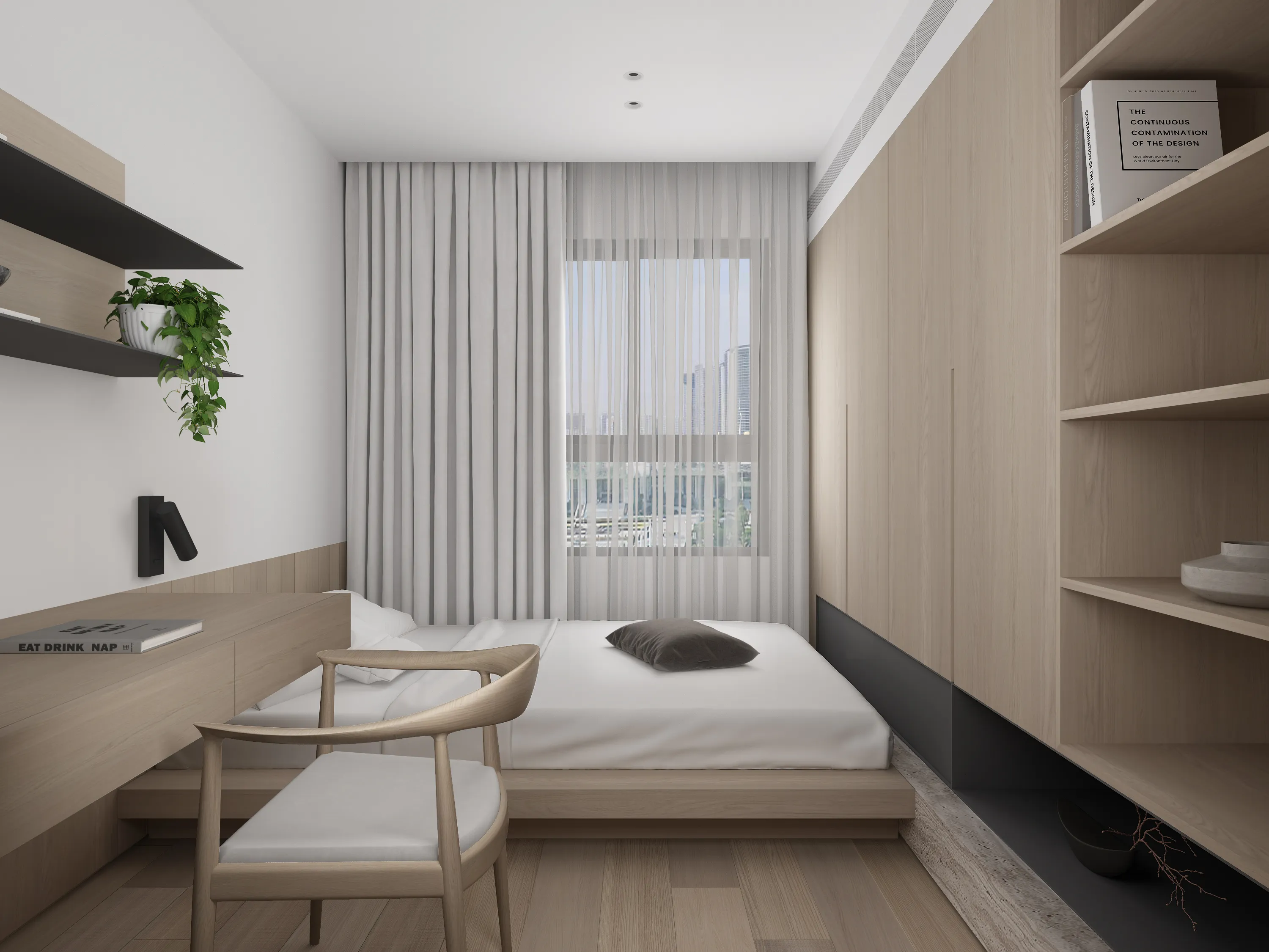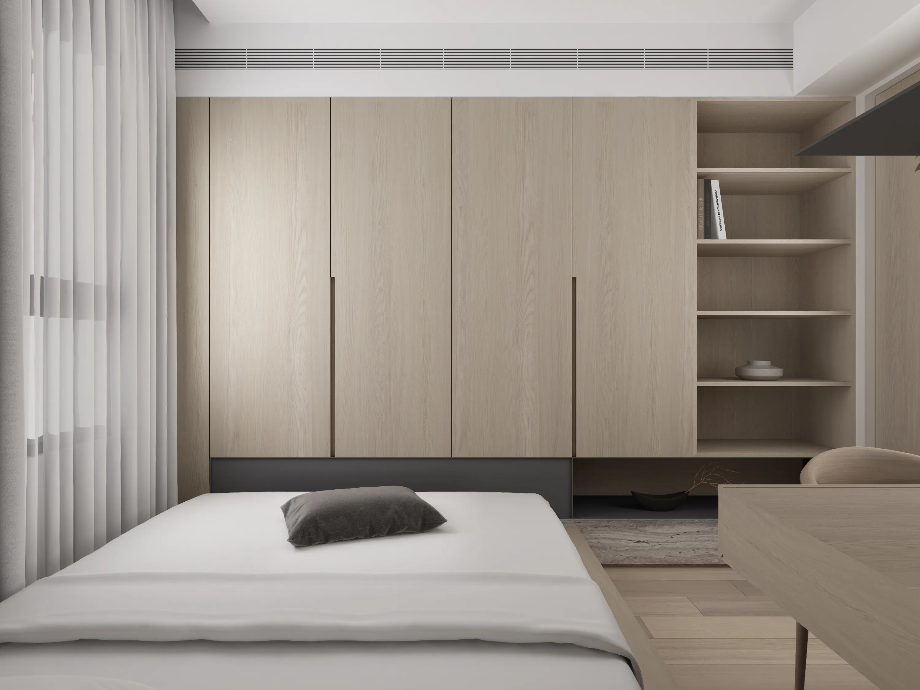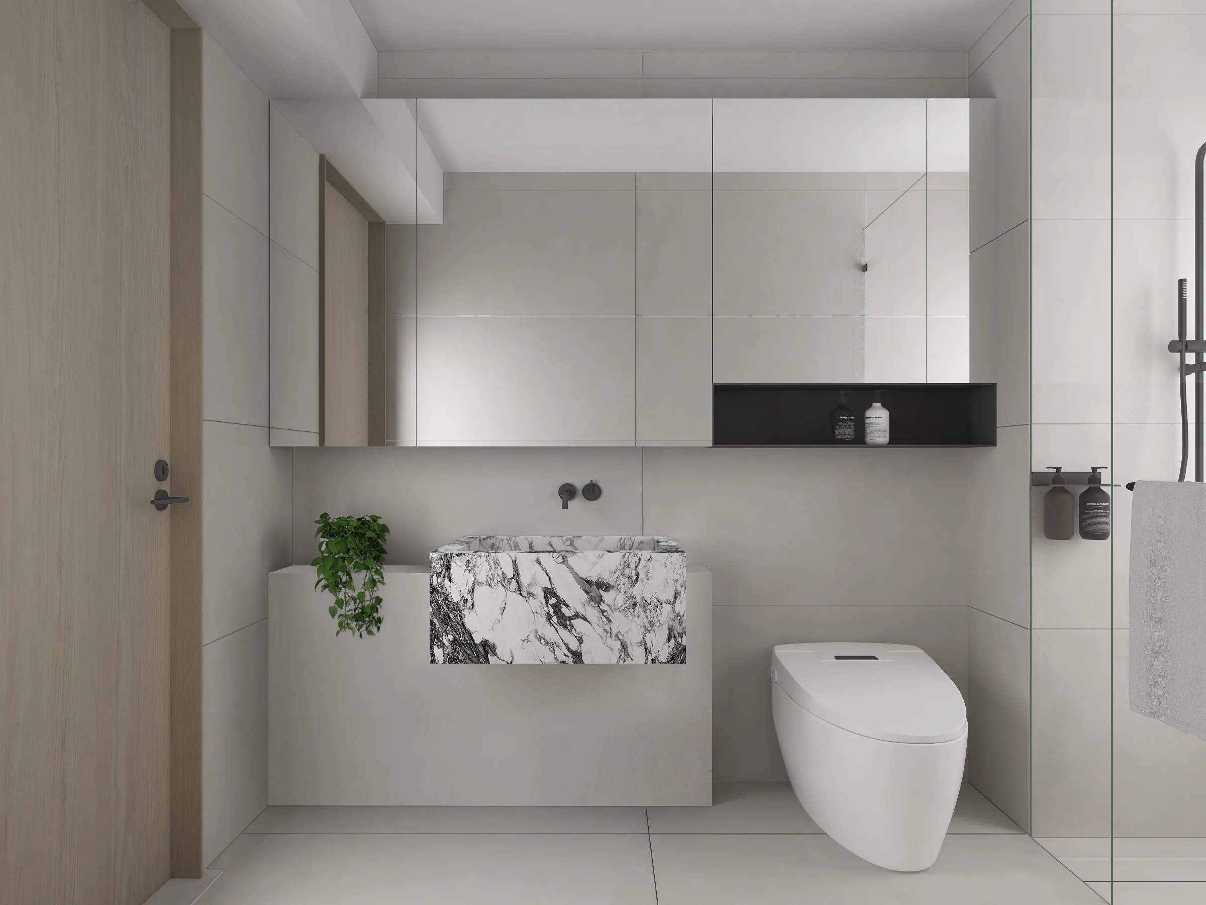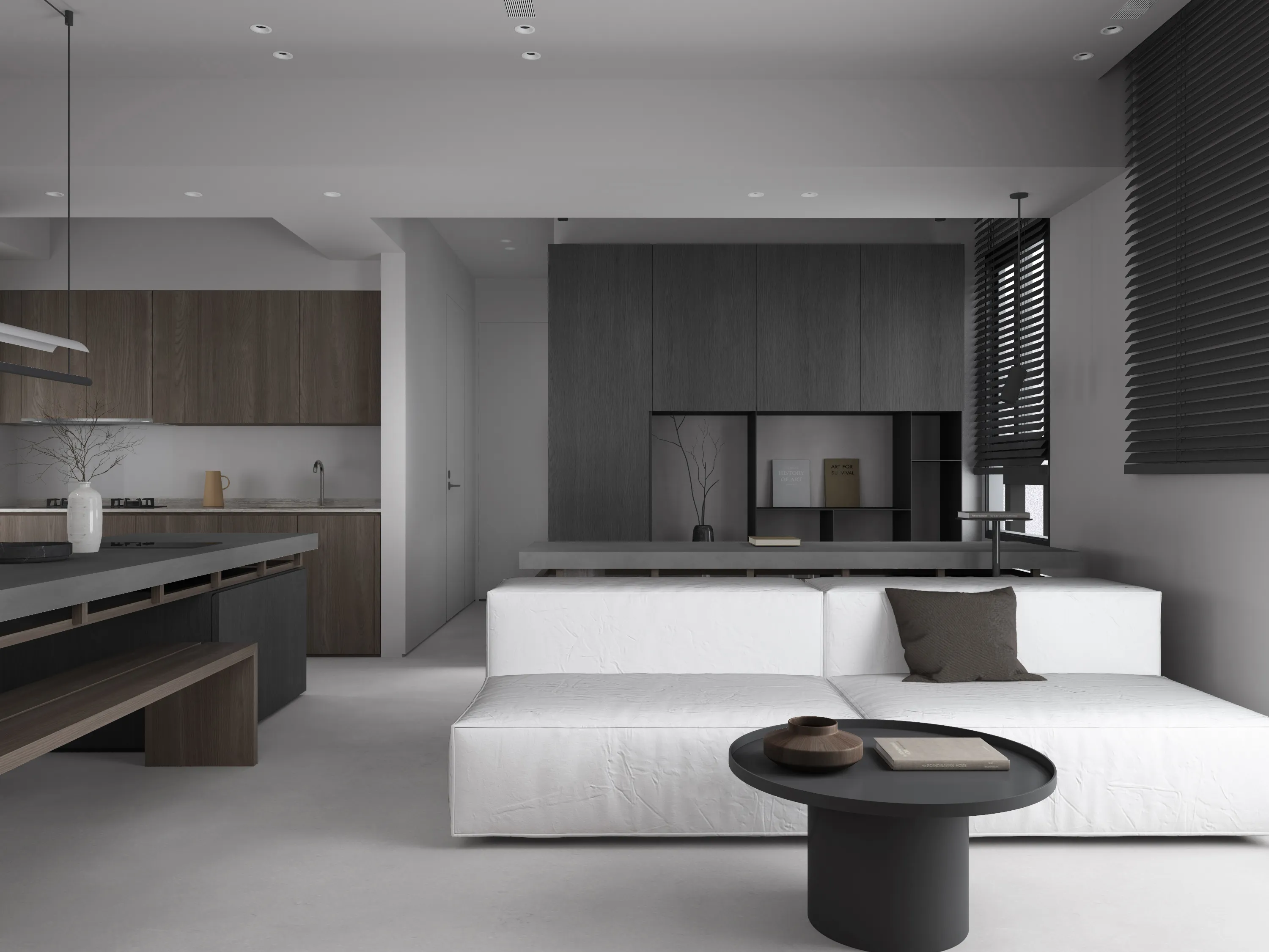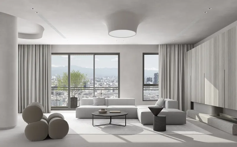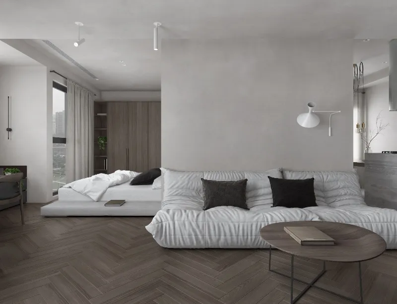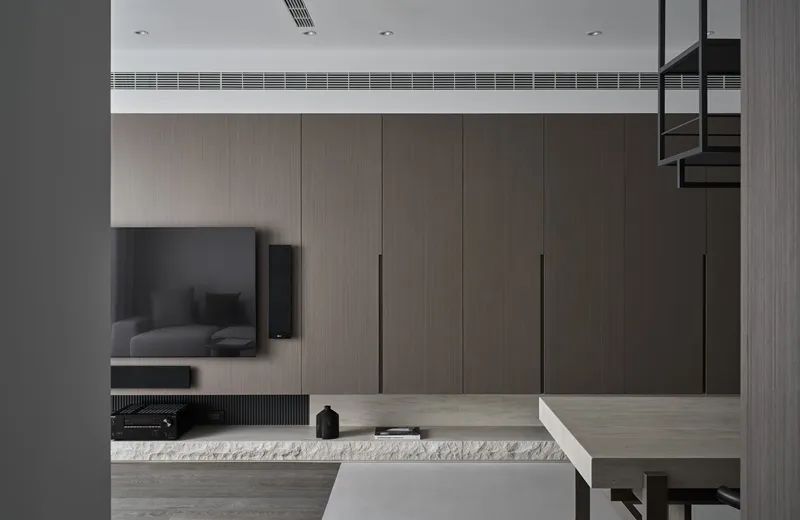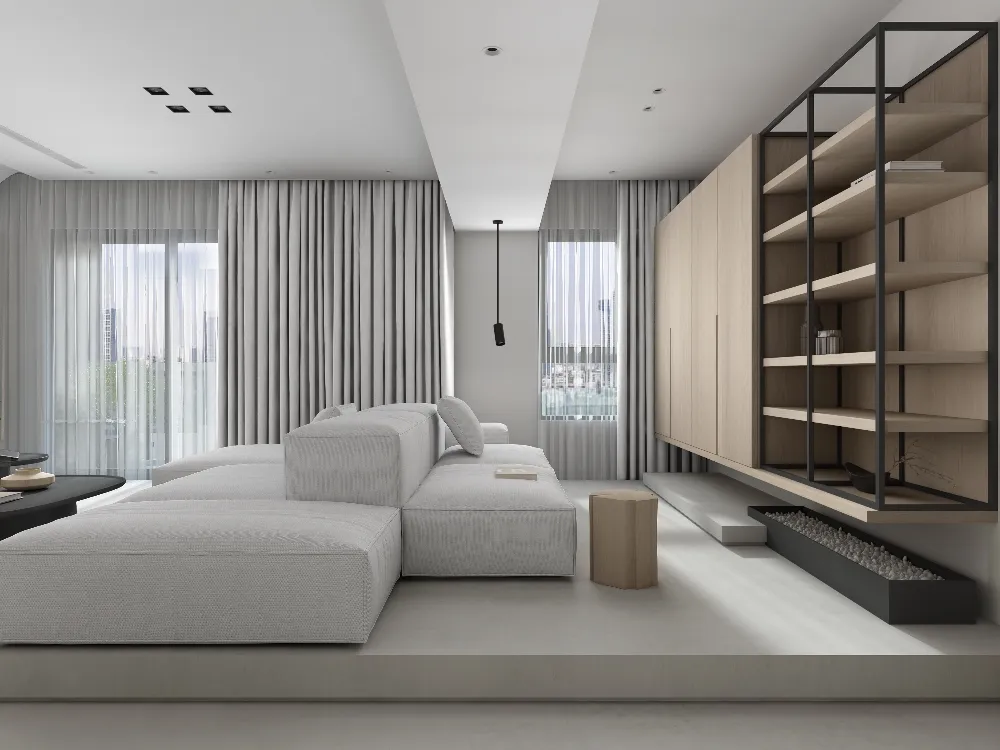
溫和色調營造舒適靜謐而質感的氛圍,利用高低錯落的層次界定了客餐廳介面,讓陽光的溫度落入整個公領域,使陽光與溫潤木質氣息調和了空間光感之美。整體空間以白色作為主要色調,運用紋理細膩的特殊塗料,藉由天與地的大面積留白,讓視覺盡可能純粹,並以柔潤的木質元素為輔,而木質紋理的電視主牆利用簡單的線條分割營造立面層次,以乾淨的視覺及簡單線條的運用,使看似分離的客廳、餐廳及廚房產生連結。私領域利用鐵件深邃的漆黑勾勒空間中物件輪廓,加深空間的視覺立體感,獨特的自然紋理透過光的暈染,為家添增幾分詩意,同時讓人專注於空間材質與軟裝帶來的細膩底蘊,讓家染上些悠閒的氛圍。
Mild colors a comfortable, quiet and textured atmosphere, and the staggered levels are used to define the interface of the living room and dining room, allowing the temperature of sunlight to fall into the entire public area, so that the sunlight and the warm wood atmosphere harmonize the beauty of the light sense of the space.The overall space uses white as the main color, uses special paint with fine texture, and uses large areas of white space between the sky and the earth to make the vision as pure as possible. It is supplemented by soft wooden elements. The main TV wall with wooden texture is simple to use. The line division creates a facade hierarchy, with clean vision and the use of simple lines to connect the seemingly separate living room, dining room and kitchen.In the private area, the deep blackness of iron pieces is used to outline the outlines of objects in the space, deepening the visual three-dimensionality of the space. The unique natural texture is smudged through the light, adding a bit of poetry to the home, and at the same time makes people focus on the space materials and soft furnishings. The exquisite details brought by it give the home a leisurely atmosphere.
CITY:
YEAR:
SIZE:m2