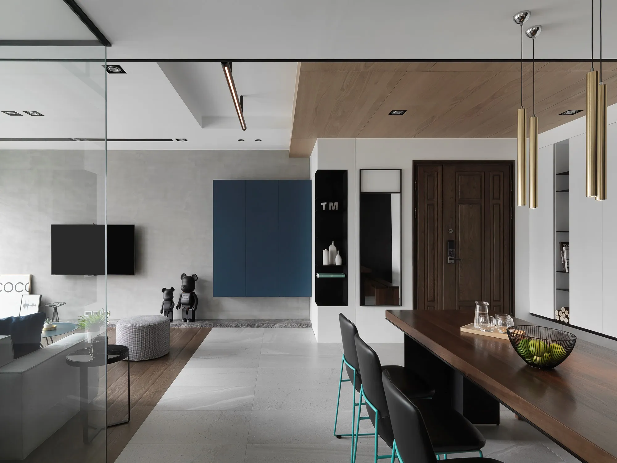
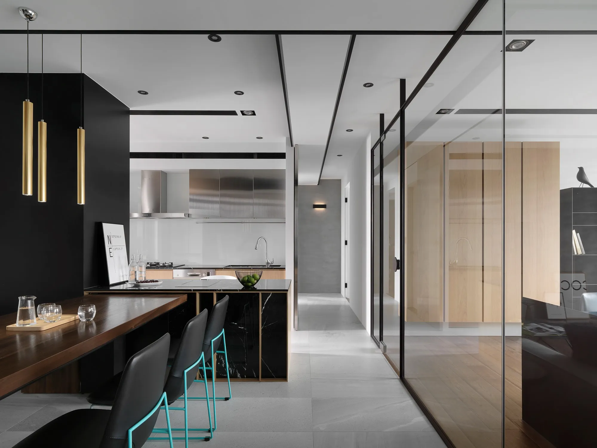
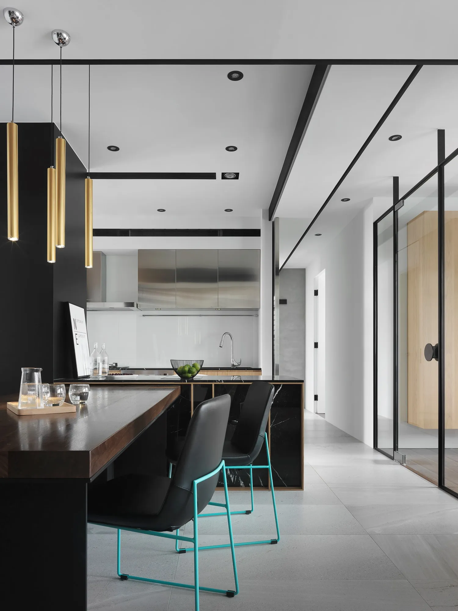
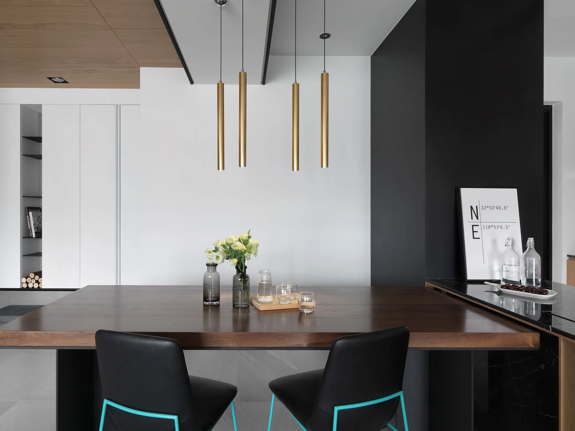
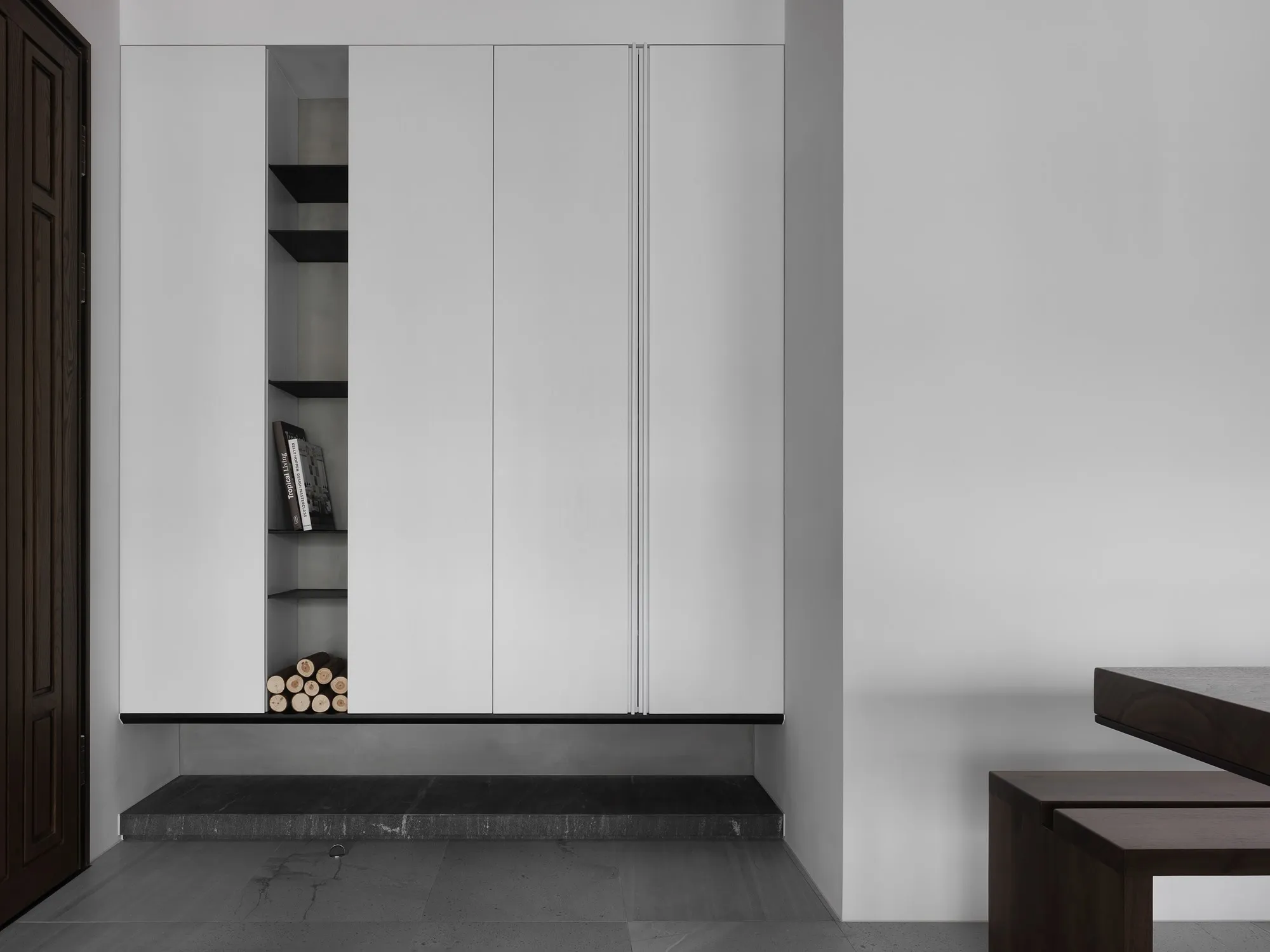
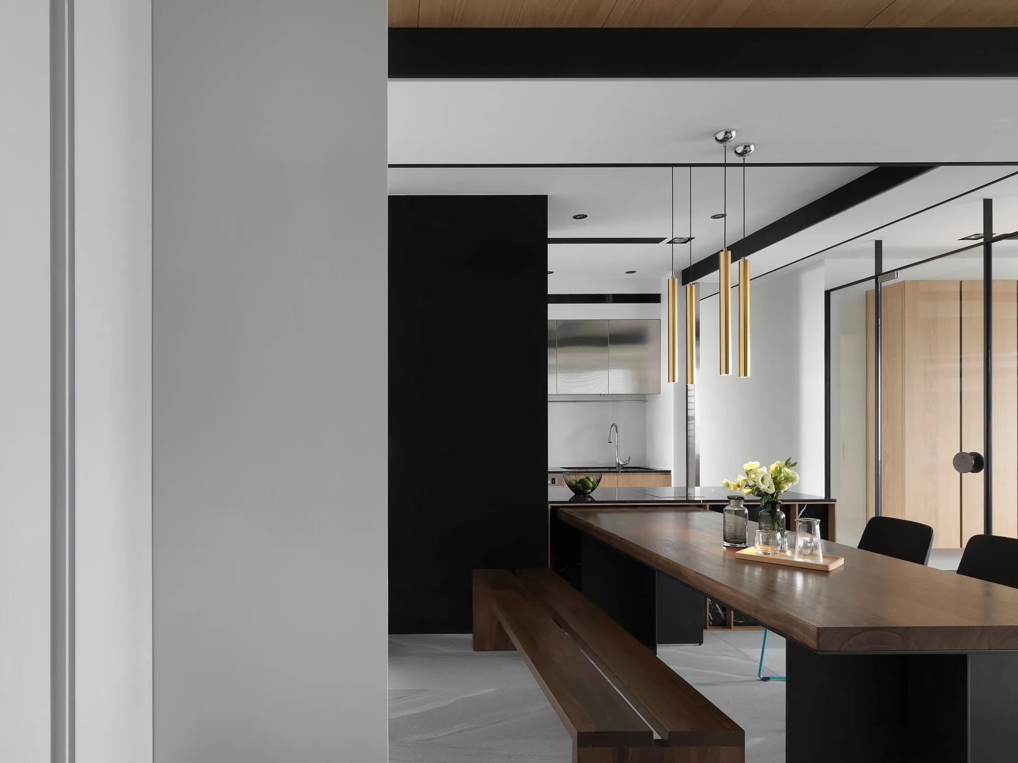
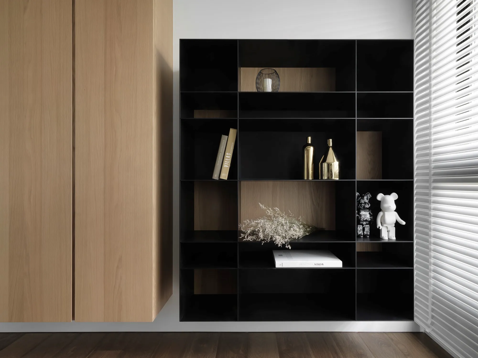
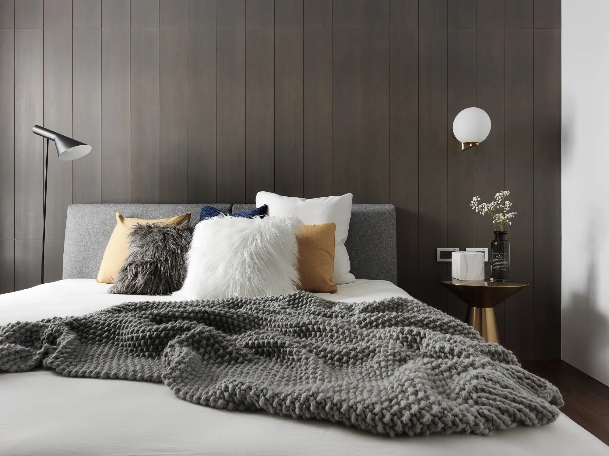
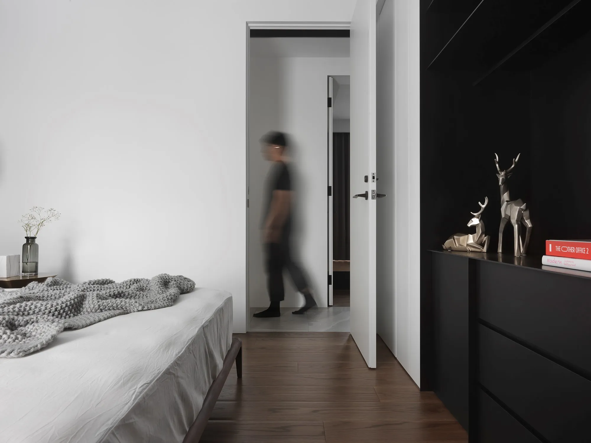
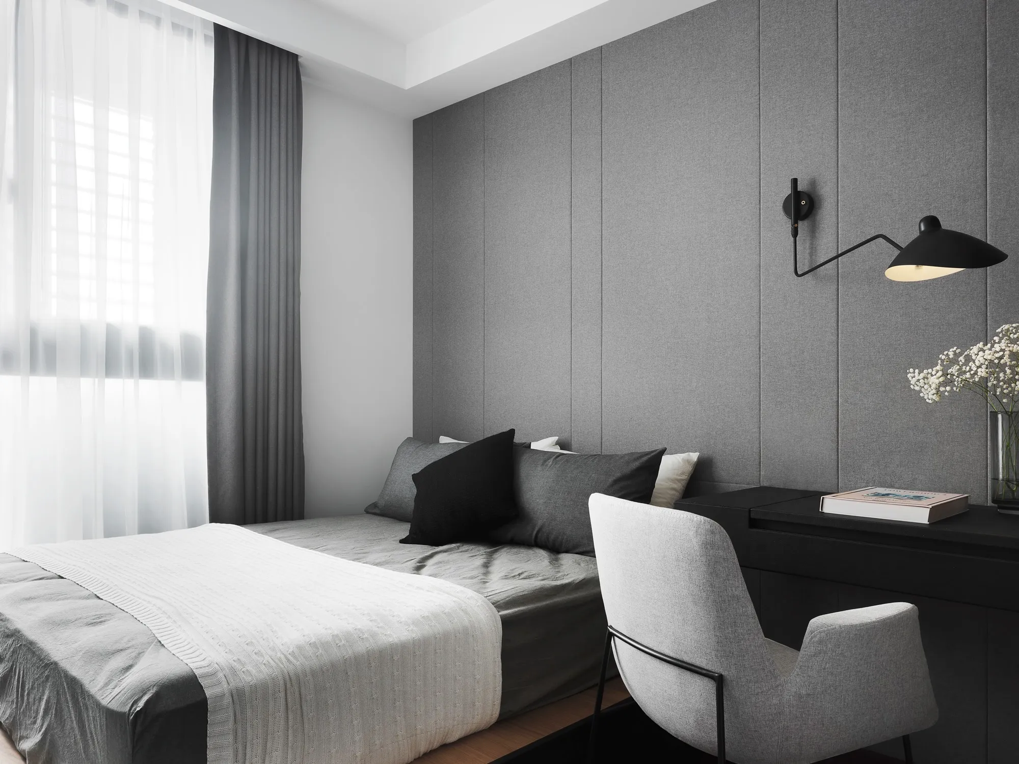
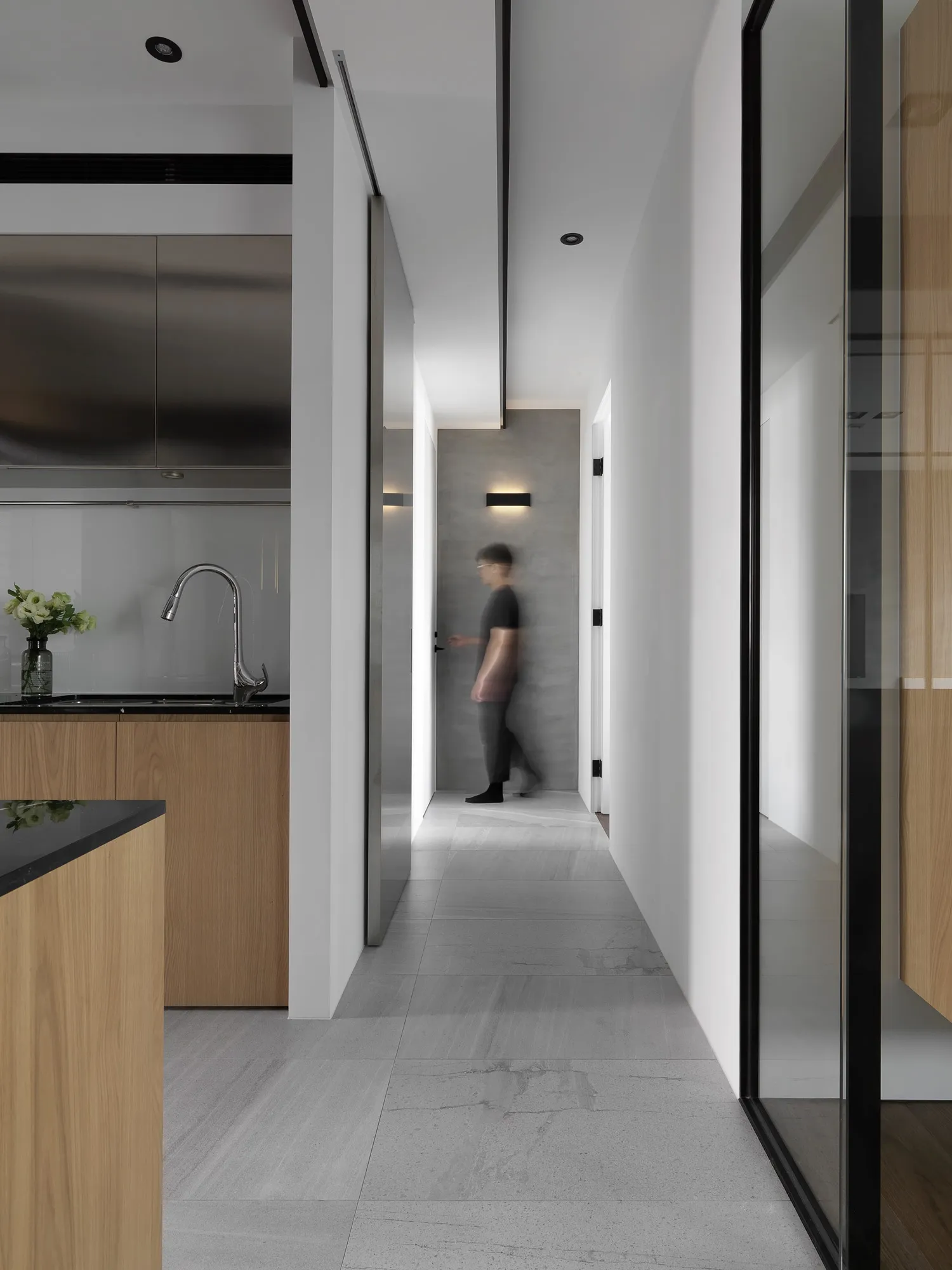
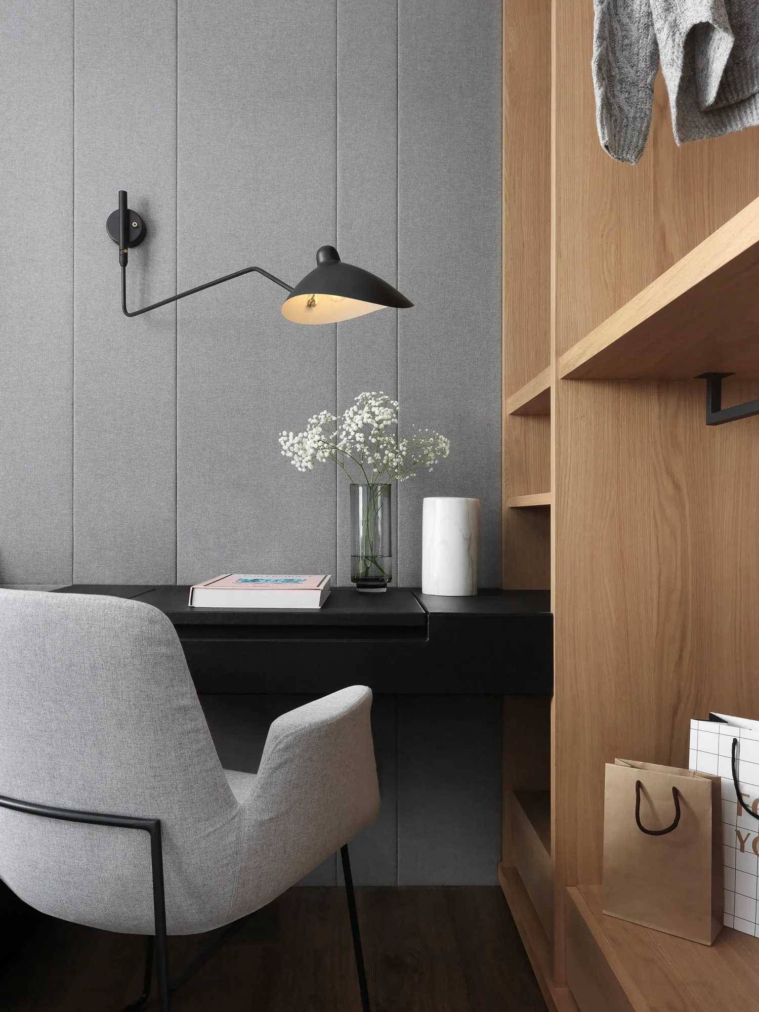
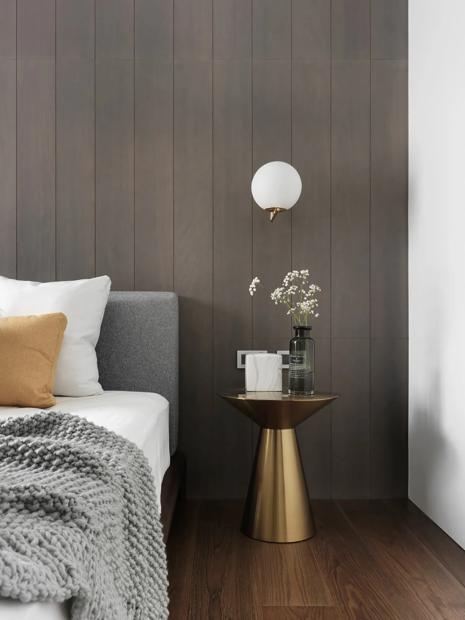
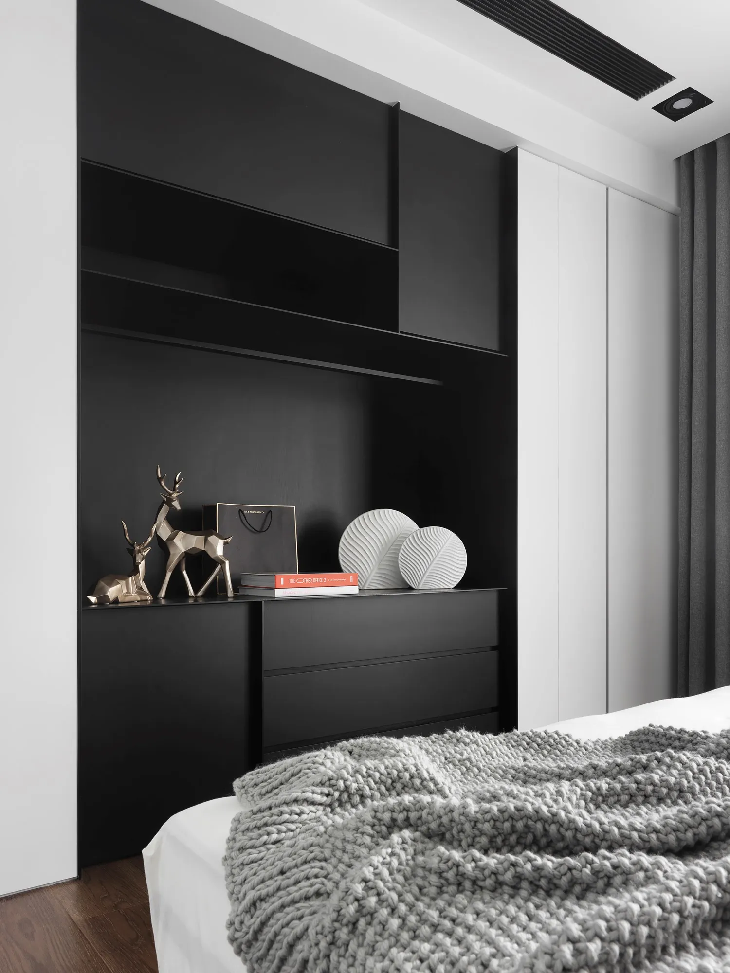
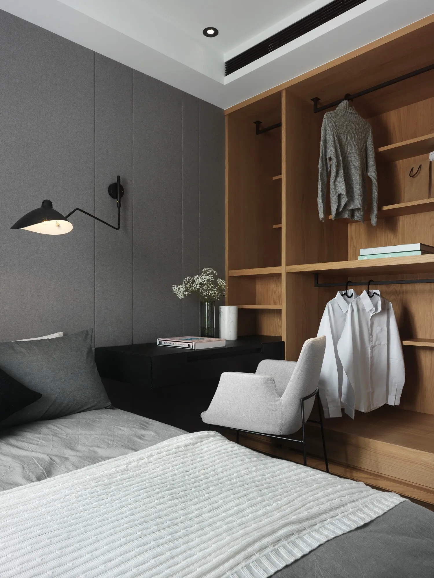
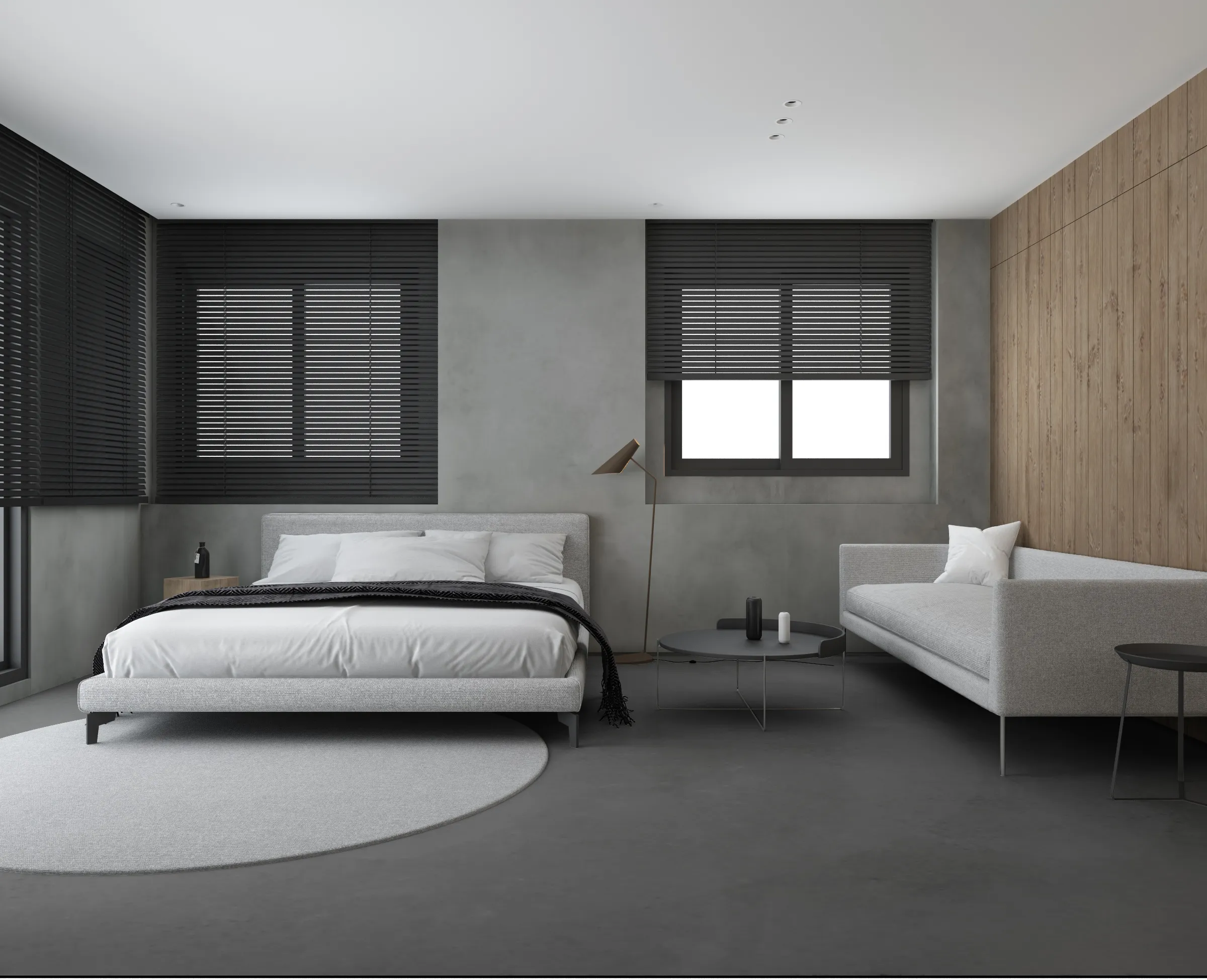
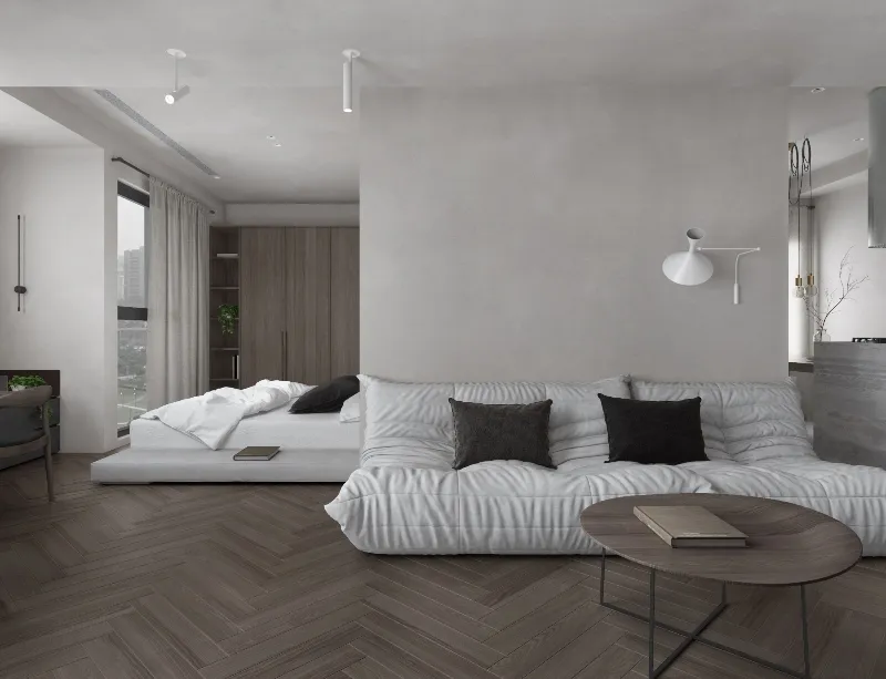
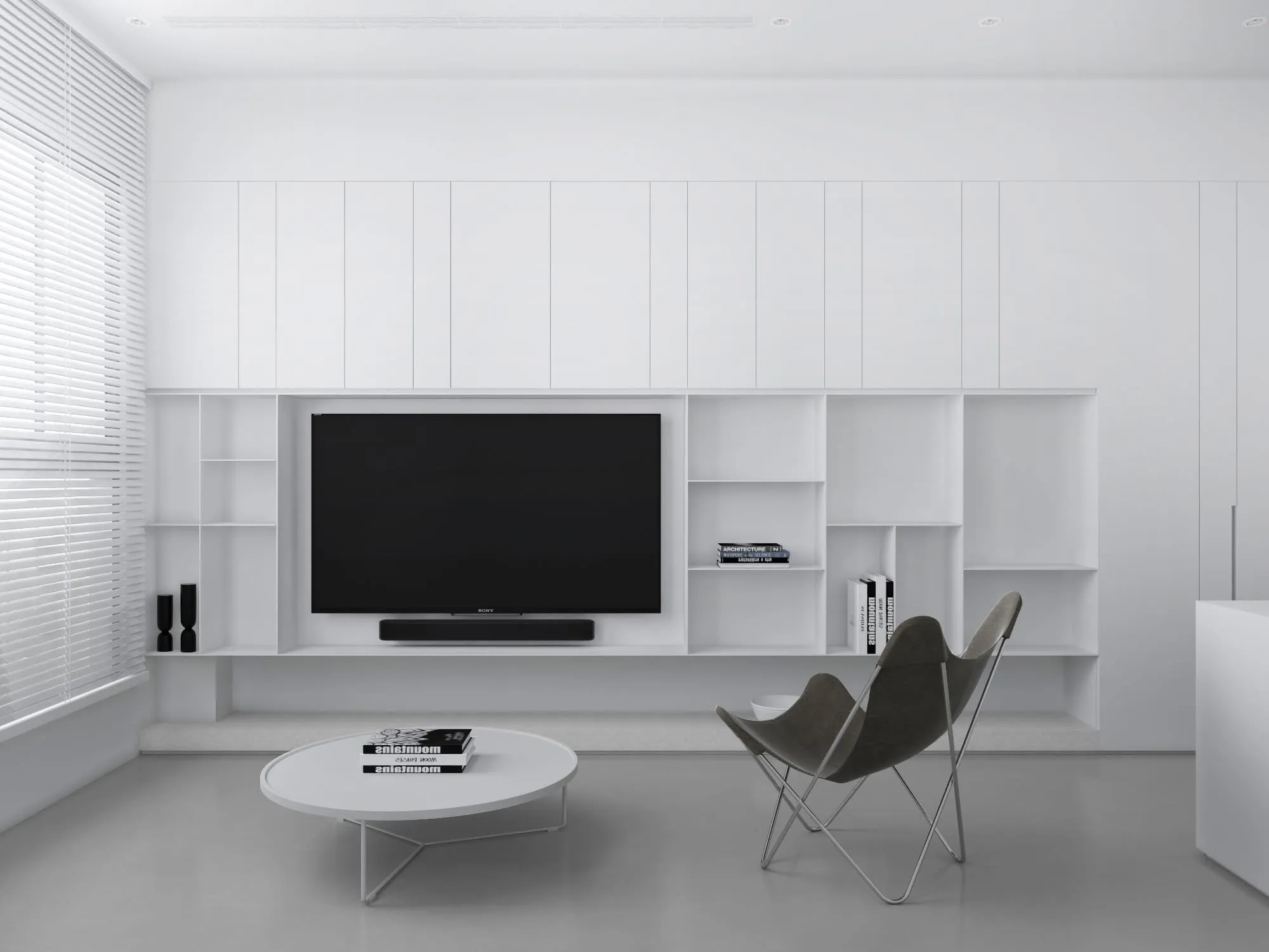
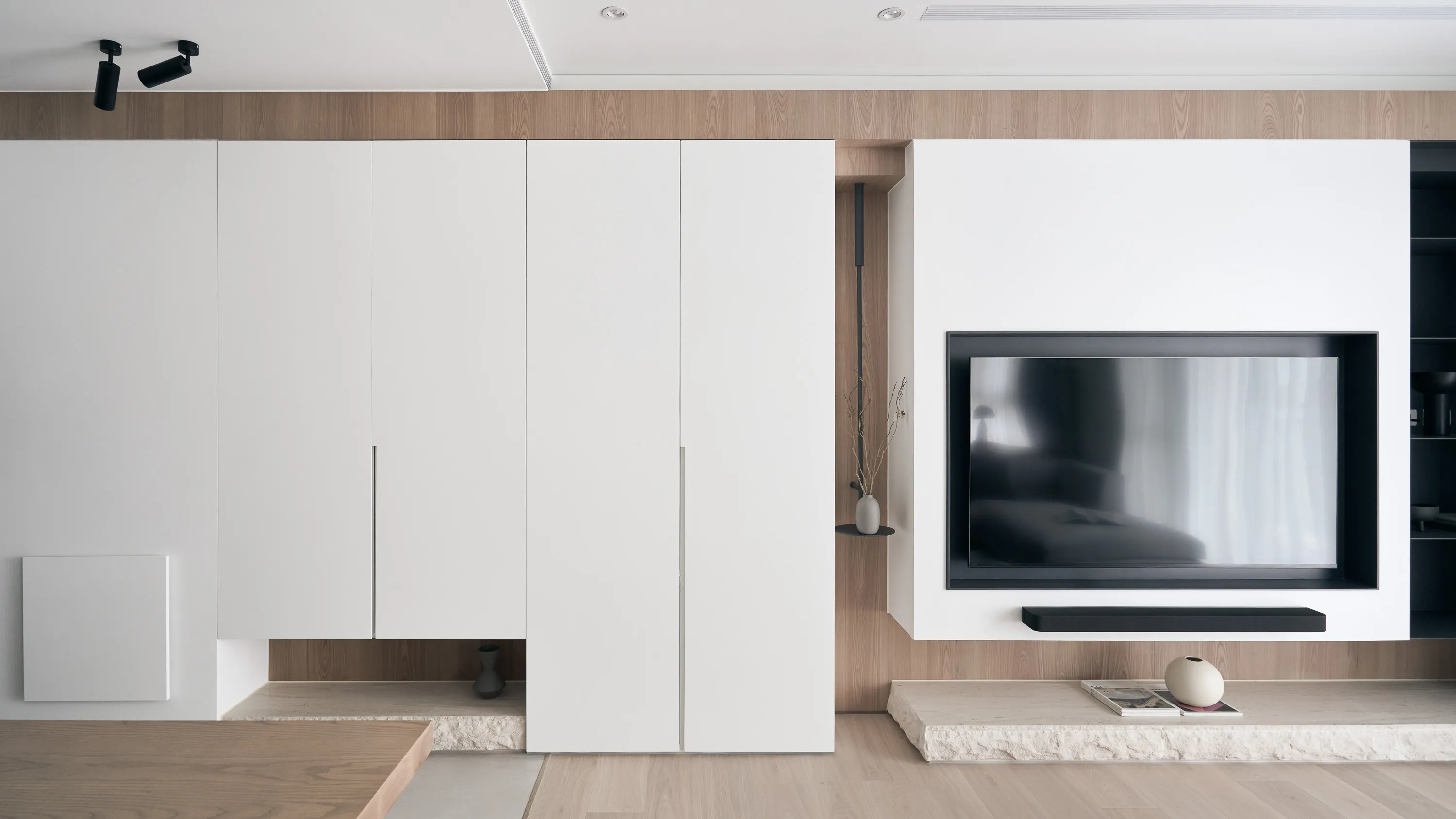
由於本案擁有先天優異的大面積採光,設計師僅將書房與廚房間局部隔間牆打開,讓日光緩緩延伸至空間的每個角落。 空間基地為新成屋,透過局部隔間牆的拆除及重新鋪設海島型實木木質地板,將原空間氛圍重新塑造,使日光稍然攀附於空間之中,無色彩的基底,材質與肌理紋路的顯現,使得空間回歸本質。在空間色彩上,業主喜愛沉穩大方用色的視覺感受,同時注重各空間流動的相互關係,最後能夠呈現簡單及個性的設計風格。設計師在空間的規劃上,著重於將室內空間上不斷的擴大,將空間與空間相互的界線巧妙運用設計手法一一的解套,將「虛」與「實」的相互交錯,進而重新定義各空間的界線,使空間之間產生令人意想不到的變化。設計上也不忘業主所需要過人的收納空間,設計師大膽的利用色彩與材質的變化,將業主注重的收納空間隱藏於空間中的各個角落。透過這樣簡單乾淨的設計語彙,給予居住者最自然樸實的空間意象,可以輕鬆悠閒的在空間待上一整天,在黑白灰無色彩中,將淺色系的自然木質感襯托展顯出來,那一絲絲自然最原始的風味,不斷傳入居住者的腦海內,進而加入光線與傢俱點綴,將空間中的層次更加往上一層邁進。為了讓公共空間整合為一體,欲將廚房與書房的隔間牆拆除,除了方便居住者可以輕而易舉的通往各空間,進而使公共區域更加遼闊自在,也讓位於室內較無採光的廚房也可以透過客廳與書房大面積的落地窗感受到陽光的溫暖,這樣一舉數得的設計手法正是設計師帶給業主的驚喜。空間屬性的界線透過地坪材質簡單的分割,將公共空間一分為二,其一為玄關延伸至私領域的義大利地磚;其二為客廳與書房相連的海島型實木木質地板,另在書房相連其他空間的兩側築起玻璃隔間,清楚的劃清空間屬性的分界外,也給予居住者一處屬於自己可以輕鬆自在的小天地。建築物旁即為一座小公園,充滿綠意,也瀰漫著優閒生活的慢步調,室內陽台不僅提供大面積採光,機能之餘,也讓空間染上一點悠閒的氛圍,讓居住者於空間之中亦能享受生活的慢步調。整體色系上以無色彩的配色搭配些許淺色木皮呈現,壁面大面積留白與櫃體白色烤漆搭配清新溫潤的木紋質感,給予空間簡單整潔的視覺感受,位於電視主牆的淺灰清水模塗料與公共區域淺灰義大利的地磚,除了凸顯該使用區域外,並作為中和空間色彩的染劑,維持空間的色彩之間的平衡,最後利用鐵件深邃的漆黑勾勒空間中所有物件的輪廓增加其整體的立體感,塑造簡而有力的空間量感。家具選擇簡單兼具個性之單品,使其不破壞空間之氛圍,易凸顯自身之特色,使兩者相輔相成,給予居住者感受最完美的空間藝術呈現。在室內燈光部分選擇重點式的燈光照明,適度分散的在空間中,以不影響自然光蔓延在空間中為首當其衝,營造自然光線與照明光線調和之美,且空間營造黑白灰無彩色的調和,使空間逐漸相容構成無違和感且簡單大方俐落的畫面。
With the advantage of ample natural lighting from large windows, the designer chose to partially open the partition wall between the study and kitchen, allowing daylight to gradually extend into every corner of the space. Originally a newly completed residence, the space was redefined by removing selective walls and laying new engineered solid wood flooring. This transformation allows natural light to gently permeate the interior, while the colorless base, along with material textures and patterns, brings the space back to its essential form.In terms of color palette, the homeowner preferred a calm and refined visual tone, while also valuing the fluid connection between rooms. The final design showcases a style that is both minimal and characterful. The layout emphasizes the continuous expansion of interior space, subtly dissolving the boundaries between different areas. Through clever design techniques, the interplay between “solid” and “void” redefines spatial limits, creating unexpected transitions between zones. The designer also responded to the client’s need for exceptional storage by creatively concealing ample storage within various corners of the home using thoughtful material and color choices.This clean and simple design language creates an authentic and grounded atmosphere, inviting the residents to comfortably dwell in the space for extended periods. The soft natural tones of the wood stand out amidst the black, white, and grey base, echoing the original charm of nature. With the addition of carefully placed lighting and furniture, the spatial layering is elevated to another level.To further unify the public spaces, the partition wall between the kitchen and study was removed—not only to enhance the ease of movement between zones, but also to open up the space and allow sunlight from the large windows in the living room and study to reach the originally enclosed kitchen area. This thoughtful approach brought both functionality and surprise to the homeowners.Floor materials are used to define spatial attributes: Italian porcelain tiles lead from the entrance to the private areas, while engineered wood flooring connects the living room to the study. Glass partitions on both sides of the study clearly mark spatial boundaries while still preserving a sense of openness, offering residents a personal corner for relaxation and ease.Adjacent to the building is a lush park, imbuing the home with a leisurely, tranquil atmosphere. The indoor balcony not only enhances the amount of natural light but also adds a relaxed rhythm to the space, allowing the residents to embrace a slow-paced lifestyle indoors.The overall palette features neutral tones with touches of light wood veneer. The white walls and matte lacquered cabinetry complement the warmth of the natural wood grain, offering a clean and tidy visual impression. The TV feature wall is finished with light grey fair-faced concrete paint, while the public area flooring uses light grey Italian tiles to highlight functionality and serve as a mediator for color harmony. Dark-toned iron accents are employed to outline the contours of objects, enhancing the depth and three-dimensionality of the space and lending a strong yet simple sense of volume.Furniture is carefully selected to be both minimal and expressive, maintaining the spatial atmosphere while showcasing their distinct character, allowing design and objects to complement each other. Lighting is applied strategically with focus lighting scattered throughout the space. Care is taken not to interrupt the natural spread of sunlight, aiming instead for a harmonious blend of natural and artificial light. The space is unified through a black-white-grey achromatic scheme, resulting in a cohesive and refined aesthetic.
CITY:Taichung
YEAR:2018
SIZE:99 m2